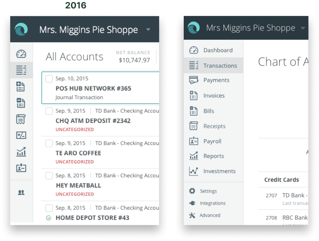
Navigation
The original menu consisted of a left-bar collapsed icon-only view, that when hovered, would expand to show the icon label.
There were no sub-menus, as each item took the user to the respective product page.
A secondary top bar displayed the business the user was browsing in.
New architecture
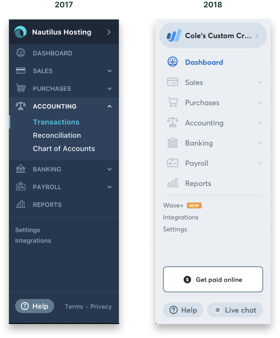
In 2017, we re-designed the navigation from the ground up. We consolidated the top and left bars into a singular left-hand bar.
Given the growing ecosystem, we created sub-menus that a user could expand/collapse to navigate to their intended destination.
In 2018, we launched a site-wide re-brand, opting for a light color scheme.
We improved the visibility of the business switcher, increased white-space, updated icons, and brought Live Chat to the footer.